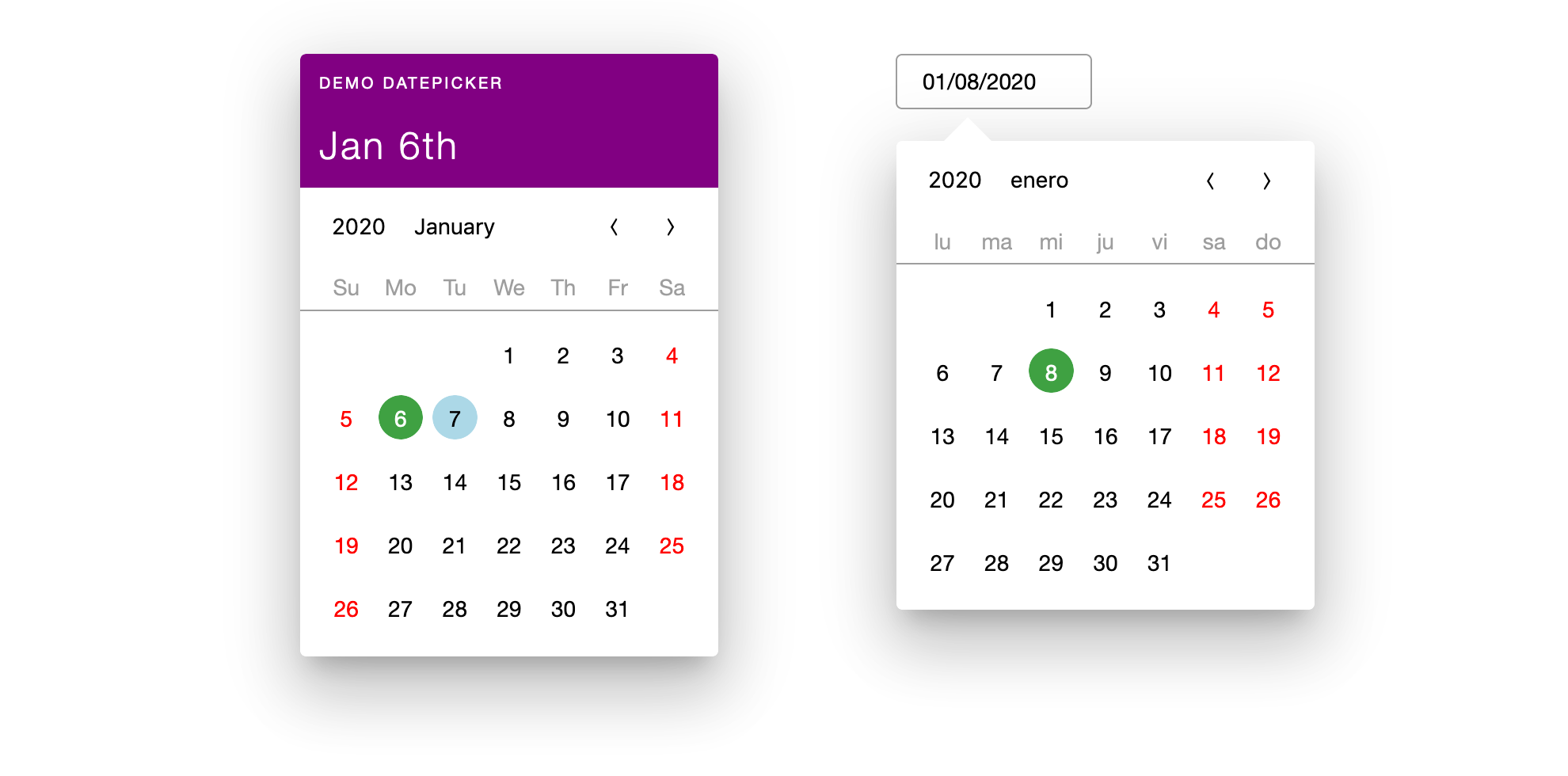
react-calendar-toolkit (RCT) is a set of React Components capable of rendering various calendars, datepickers etc. There are many good datepickers on the market. Unfortunately, most of them are style-opinionated, so if you like logic of chosen datepicker, you are subscribing to the design of it. But your website or application style may be completely different. With RCT you don't have hack third-party CSS, you can write your own styled UI components and RCT will render them.
You can use react-calendar-toolkit with default theme or use custom UI components to change look and feel to match your website or application style.
Fully customizable user interface
RCT uses render props to decouple Calendar logic from the user interface part. Thus, developer can customize datepicker or calendar look and feel by providing custom React components to render parts of it. Frameworks, Styled components, CSS-in-JS solutions are all compatible with this approach.
Date entry components (Day, Month, Year) receive date prop, which is Date object, containing the date to render. Also, these components receive onDateSet prop, function expecting Date object to set as selected date (e.g. on click event) for the whole Calendar.
// date comes from the propsconst handleClick = () => {onDateSet(date);};
Date entry components can be wrapped with provided React Component or DOM node, see wrapWith props.
Selector component gets incrementMonth and decrementMonth props to set selected date plus or minus 1 month from selected. This props are bound to month stepper arrows. Also it gets todayDate and selectedDate props instead of just date, since it is not related to specific date.
Header component gets todayDate and selectedDate props for the same reasons as above. Also it gets title prop with the custom name of Datepicker.
Weekday component gets just week day localised name to render.
Other Features
Localization
You can use any locale from date-fns or create custom one.
Calendar views and precision
year > month > day
Datepicker toolkit architecture introduces concepts of precision and calendar.
Precision defines accuracy of date being selected. E.g. if props.precision === 'month' user can select month, not specific day. Also, only year and month calendars are available with this setting.
Calendar is a collection of date entries (year, month or day). Each entry can be React Component or DOM node. It receives corresponding Date object and onDateSet props. Each Calendar has corresponding precision. Calendar renders collection of date entries and wraps them with provided React component or DOM node.
Changing precision
User can switch "downwards" (from bigger to smaller unit) by clicking year or month entries on corresponding Calendar. If target precision was met, e. g. user click year entry when props.minPrecision === 'year' onDateSet callback is triggered. The value callback receives Date of the beginning of specified datetime precision, e.g. when props.minPrecision === 'month' onDateSet Date value is 1st day of the month, when props.minPrecision === 'year' - January 1st of the selected year.
User also can switch "downwards" and "upwards" by using Selector.

Browsers support
 IE / Edge |  Firefox |  Chrome |  Safari |  iOS Safari |
|---|---|---|---|---|
| IE11*, Edge | last 2 versions, ESR | last 2 versions | last 2 versions | last 2 versions |
/* needs polyfills.